Brand guidelines

v1.3
Last update: 11. Jan., 2024
* MikroTik brand assets — including its trademarks, logos, icons, designs, trade dress, fonts, names of products, services, sounds, emojis, and any other brand features and elements, whether registered or unregistered (“Brand Assets”)—are proprietary assets owned exclusively by MikroTik and its group of companies. These Guidelines, which may be updated from time to time, detail how our Brand Assets can be used under specific circumstances. Many uses—including our logos, app and product icons, and other designs - will require a license first. Unless you have an express license from MikroTik, these Guidelines will exclusively govern your use of our Brand Assets. We’re happy to have you promote your MikroTik presence and content. Just make sure your ads and marketing materials don’t suggest that MikroTik is sponsoring your promotions or formally affiliated in any way.

Logotype

PRIMARY

This is our logo primary representation. This is how it should represented most of the time. Always keep in mind that our brand is special and our logo should be treated with care.
Primary logotype

Story

The background shape of our new logo is inspired by the main principles of our product design:
it’s all about math and efficiency.

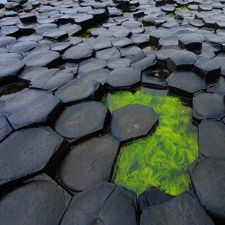
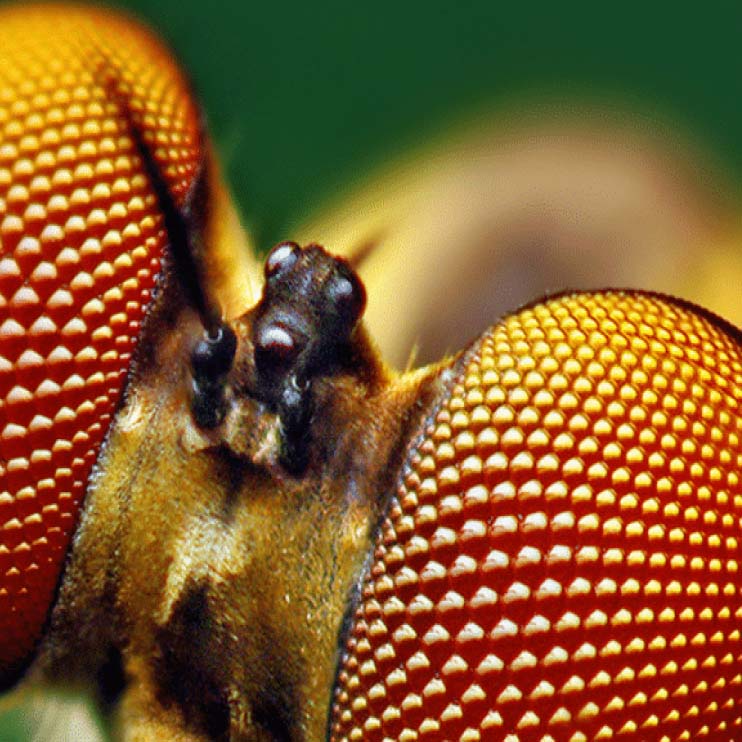
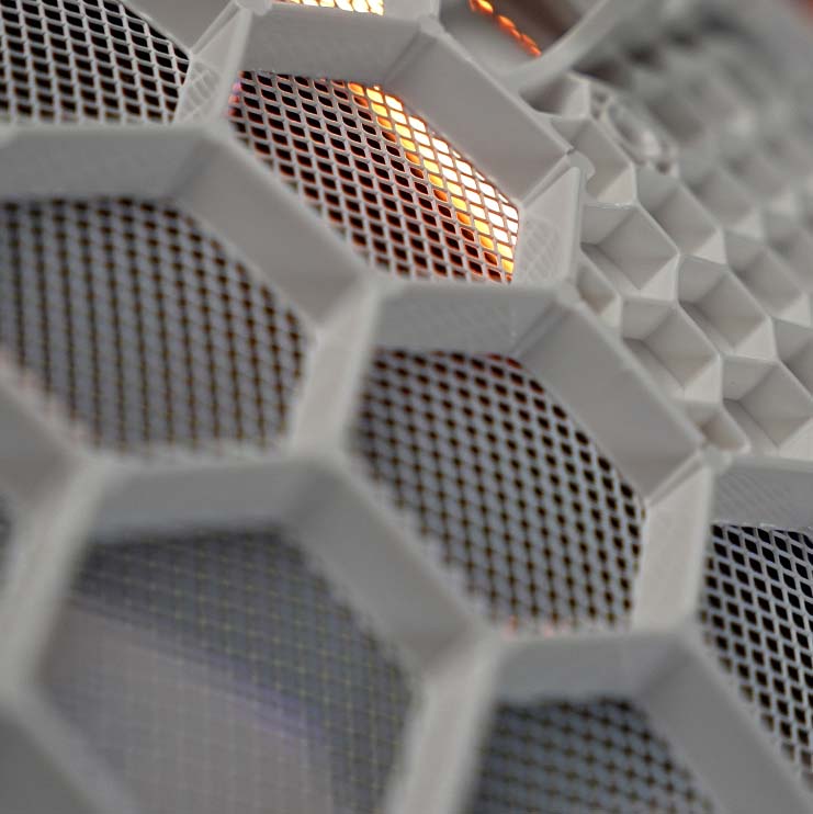
You can find hexagons everywhere – beehives, snowflakes, basalt columns, organic chemical compounds like benzene, insect eyes... The hexagon is all around - because it wastes no space or energy.
Basalt columns
Bee eyes
Mikrotik router dish closeup
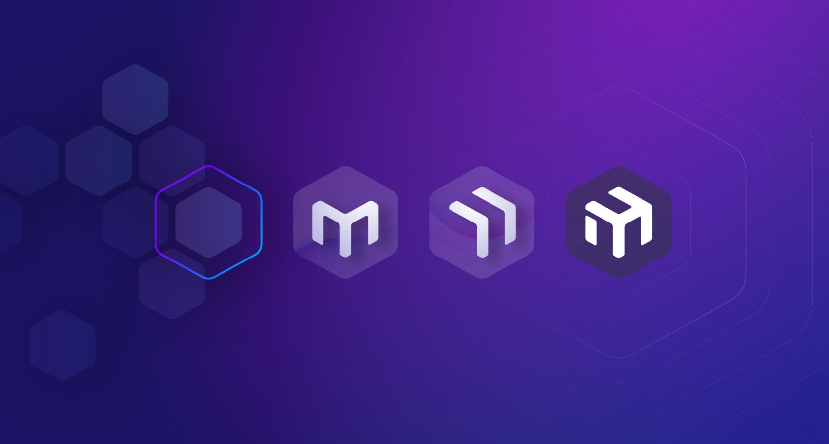
The arrow-looking “M” also stands for something bigger: it is an agent of growth and curiosity. Your endless creativity with MikroTik devices inspires us to always return to the drawing board and do better. Each new product is an exciting opportunity for us to see what the fantastic MikroTik community will come up with. With your support, this arrow will keep going forward no matter what.
Mikrotik logo evolution

We commit to always look for the most effective solutions to deliver the right devices for your networks.

Thank you for being a part of this journey!

Construction

You should treat our logotype as one whole object. By any means do not try to edit any of the logos elements when using it. Logo construction is purposefully created to visually work. It is strictly forbidden to try to replicate or make your own version of it. Always use files provided in this Brand Book.
Logo proportions

Logo don’ts

Do not change ratio
Do not change ratio
Do not use in an angle
Do not scale, skew or bend elements
Do not use shadow
Do not use shadow
Do not use any color besides the primary brand colors
Do not outline
Do not outline
Do not apply patterns
Do not use name without symbol

Clearspace

It is important to avoid situations when logotype is used with an inaccurate space around it. Clearspace allows logotype to breathe, to catch correct attention and not to fall over the edge or visually fall on to object next to it.
Logo clearspace
It is easy to determine the correct size of the clear space. Use logotypes hexagons height as a guide and place it just next to the logotype in all directions.

There will be situations when it’s physically not possible to ensure these rules. If so, don’t hesitate asking MikroTik’s brand team for help on how to use our logo correctly.

Versions

It may be necessary to substitute for an alternate version of the logo.
Use these logo versions with caution. Always start with primary logo version and work your way down if design situation asks for it.

PRIMARY LOGO

Primary logo
Download logo files:

SECONDARY LOGO

Secondary logo
Download logo files:
It’s acceptable to use only symbol in situations where brand name is recognizeable.

PRIMARY SYMBOL

Download logo files:

SECONDARY SYMBOL

Download logo files:

Usage

Positioning

Logo visually likes to be positioned on the left top or bottom side. In some cases its acceptable to position logo in the center.
Logo positioning

Logo in colors

PRIMARY

Black logo on white
White logo on black

SECONDARY

Gray logo on white
white logo on gray

BACKGROUND

Use primary black or white color for logo when placing it on different backgrounds. Choose version that has the best contrast as ar result.

Light gradient background
Dark gradient background

Avoid over detailed backgrounds.

Do not use logo on detailed background
Do not use logo on detailed backgroun

Sub brands

When using sub brands, it’s easy to incorporate them in an inline manner. Following these simple rules and basic examples, it’s possible to create sub brand with any naming.
Mikrotik Certified logo Mikrotik Academy logo Mikrotik Training Academy logo Mikrotik MTCSA logo
Logo subbrand layout rules
There is also an option to incorporate logo with a tiny notation. Examine below examples and layout rules.
Made for Mikrotik logo Powered by Mikrotik logo
Logo tagline layout rules

Colors

Color plays a crucial role in our identity. By using them, we ensure consistency of our logo looks. Our logo is always presented in one of the following colors.
Mikrotik
Black
CMYK
RGB
HEX
Pantone
RAL
100 40 50 90
14 14 16
#0E0E10
Black C
9005
Mikrotik
Gray
CMYK
RGB
HEX
Pantone
RAL
0 0 1 54
118 118 117
#707372
424 C
0005000
Mikrotik
Light
CMYK
RGB
HEX
Pantone
RAL
5 5 5 20
200 200 199
#C8C8C7
Cool Gray 2 C
7047

Complementary colors

We’re full of energy and ideas. That’s why we like to be in color so we can better express our creativity. We use these gradient patterns and create more to identify our products and express our uniqueness and creators talent.
#c33366 #692878
#015ea4 #012d4e
#cf0f14 #5f0a0a
#87d3db #1f417a
#ee9b01 #ee4f01
#3660b9 #5f2965
#3bb5b6 #44de95
#582d7c #1fc8db
#017c65 #2c3a43
#a3d16e #155757

These gradients give only example on how we commonly use colors in our product and marketing design.

Typography

By using our defined design typeface we are consistent across the board. No matter is it device labels or marketing brochure, it’s always the same unique look that makes us stand out and be recognisable.

Typeface

SANS-SERIF

Manrope

ABCDEFGHIJKLMNOPQRSTUVWXYZ
abcdefghijklmnopqrstuvwxyz
0123456789!@#$%^&*()?+

Light 300

RouterOS is the operating system of RouterBOARD

Regular 400

RouterOS is the operating system of RouterBOARD

Bold 700

RouterOS is the operating system of RouterBOARD

Extra Bold 800

RouterOS is the operating system of RouterBOARD

Link to download:

MONOSPACE

JetBrains Mono

ABCDEFGHIJKLMNOPQRSTUVWXYZ
abcdefghijklmnopqrstuvwxyz
0123456789!@#$%^&*()?+

Light 300

RouterOS is the operating system of RouterBOARD

Regular 400

RouterOS is the operating system of RouterBOARD

Bold 700

RouterOS is the operating system of RouterBOARD

Extra Bold 800

RouterOS is the operating system of RouterBOARD

Link to download:

Naming

We use merged words, abbreviations and shortenings with a capital letter in our company and product names.
Correct way of using them are listed below.
MikroTik naming rules

MikroTik

RouterOS

WinBox

WebFig

BackToHome

NetInstall

FlashFig

BTest

There are some exceptions to mension that are still present and will keep on existing like that, such as:

RouterBOARD

The Dude

Beacon Manager

MikroTik Home